


Sometimes your requirement demands that you display charts based on user selection. it is very easy to accomplish this task in Tableau.
Steps to display charts based on selection in Tableau
- Connect to data source
- Create charts
- Create a parameter
- Create a filter which uses this parameter on each chart
- Display charts on the dashboard and show the filter
As a first step, I will create 2 charts.
- Launch Tableau desktop or Tableau Public
- To add datasource click on excel. Browse to your data source. This example uses Sample-Superstore.xls. This data source comes with Tableau installation.
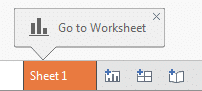
- In Tableau, you can see 3 xls worksheets under Sheets. Double click on Orders. To create a visualization, click on Sheet1 all the way at the bottom

4. Fields from the excel sheet are automatically divided into Dimensions and Measures. If you want to learn about Dimensions and Measures in detail , visit my blog on Dimensions and Facts
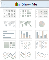
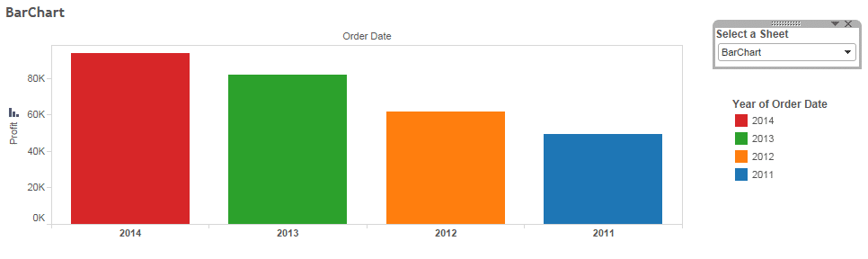
5. Drag Order Date from the Dimension to the Columns shelf and Profit from the measures to Rows shelf. From Show Me select bar chart
Bar chart will appear as the one below

6. Rename Sheet1 as BarChart
7. Right click on the sheet you just created and select duplicate sheet. Change the name of the Sheet to Trend
8. From the “Show me” select the Line chart
9. Now you have created 2 sheets Bar and Trend. Now will work on showing these charts dynamically by selecting options from the drop down list
Steps to Show charts based on Selection in Tableau
- Right click on the measures or dimensions area and select Create Parameter

2. Give the name to this parameter. I will give “Select a Sheet”. Select Data Type as String. From the Allowable values, check the radio button for List
3. Under List Values, add values as All, BarChart and Trend. These are the names of the sheets we created earlier.
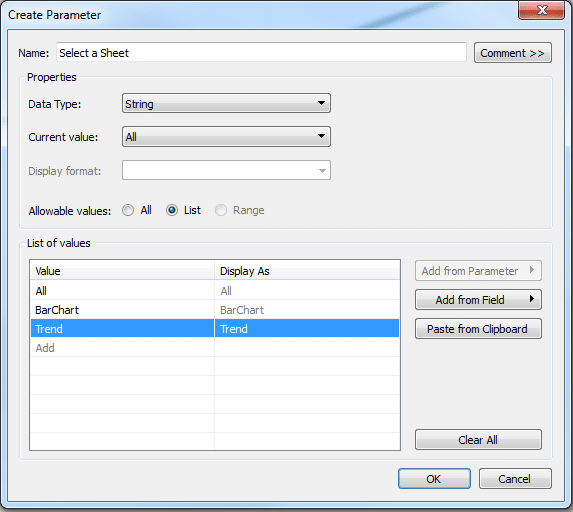
4. This parameter will show up all the way at the bottom of the sheet below Measures area
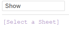
5. Navigate to Dimension or measure area and select Create Calculated field. I will name this field as Show
6. In the calculated field, select the parameter created earlier “Select a Sheet”. This calculated field will show up in the Dimensions area.
7. On each sheet – BarChart and Trend. Drag calculated field “Show” to the filters pane.
Navigate to Bar chart and drag Show to the filter area. Choose Custom value list.
In the box “Enter Text to Search” enter BarChart and click on the + next to it. The spelling of the BarChart should be the same as mentioned in the parameter.
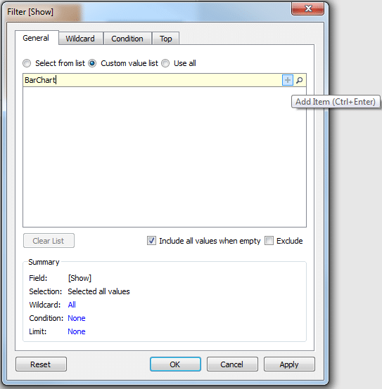
9. Your chart may disappear. Right Click on the empty space in the chart area and select parameter, to show parameter

10. Your parameter will show up on the right side. From the parameter, drop down select BarChart and your BarChart will show up
11. Follow the same steps for Trend sheet too.
12. Now create a dashboard. Double click on the sheets BarChart and Trend to left to place them on the dashboard. Use the parameter drop down to display the charts based on the selection.
13. Click on each chart and select floating. This will help you in adjusting in size of the charts and their placement on the screen.
Curious to know how to accomplish this in QlikView, visit How to display charts based on selection in QlikView


 : http://techkoncepts.com/
Thanks Chandraish, I really enjoyed creating my 1st dash board using this article.
Step by step process you mentioned in here had been very easy to follow and very helpful.