In my previous post how-to-create-different-charts-in-tableau-part-1
you have learned how to create Text table,Heat Maps,Maps and Pie charts. In this article i want to share with you some other types of charts.
I will use Superstore.xls as data source. Superstore.xls comes with your Tableau installation and can be located in \Documents\My Tableau Repository\Datasources\
1. Bar Chart
Bar chart is used for the comparison of quantitative data over dimensions.
To create Bar chart, connect to Superstore.xls and use the Orders sheet.
From the left, drag Order date from the dimensions to the Columns shelf. Drag Sales from the measures to the Rows shelf. Tableau will automatically draw Line chart for you.
You can change it to Bar chart from the Show Me. Click on swap from the tool bar to change the direction of the Bars. Click on Abc in the tool bar to display the numbers on the top of the bar.
This can easily be changed to line chart , by selecting line chart from “Show Me”
Stacked Bar chart is also easy to create.
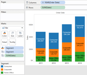
In the above chart, drag field Segment to the columns shelf and from the Show Me ,choose Stacked bar. It is next to horizontal bars.
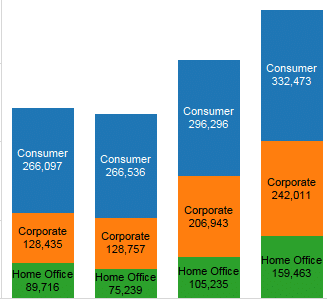
Stacked bar will display how each Year sales is distributed in Segments.
Drag Sum(Sales) and Segment to Label card and you will get the following stacked chart.
2. Circle Views
Circle charts are also a good way of highlighting key data attributes. The size and color of the circle can help in displaying the KPI’s
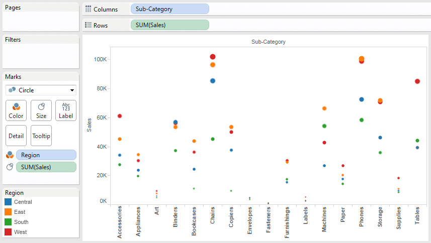
Create a new sheet.Drag Sub-category on to the Columns and Sales to the Rows. From Show Me, select Circle View, it is one below the stacked chart in Show me. Drag Region to the color card and Sales to the Size card.
You will get a chart like below It shows Regions in color and size of the circle Shows the Sales. From this chart it is clear that Chairs in Region West is leading in Sales.
3. Line Chart
Line chart is more suited for showing the Year over Year trends. Use the Bar chart to create the line chart.
Right click on the Bar chart sheet and select Duplicate sheet. Select Lines from Show Me. This chart will show Year by Year trend of Sales.
4. Area Charts
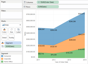
Area charts are a combination of Line chart and Stacked chart. You have seen the Stacked chart in Bar chart Section above. You can convert the same chart into the Area Chart.
Area chart colors/fills the area between the lines. The colored portion at each slice also shows the Sales as compared to the overall Sales.
Area chart will show 3 areas of Segments with Sales for each Year and Segment.
5. Dual Combination chart
Click on Show Me and you will notice Dual combination or dual axis chart next to the Area chart. Dual combination chart allows measures to be represented on 2 axis.
In our example, we will use Profit % and Sales.
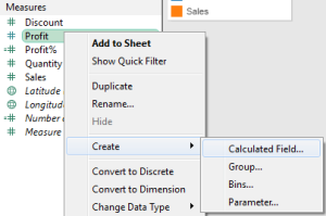
Right click on the data section and create calculated field Profit % . Use the calculation Sum([Profit])/Sum(Sales)
Now select Profit%, Sales and Order Date from the data section. Click on Show Me and select Dual combination chart. This chart will display Profit % and Sales on different axis
Want to learn how to use a Chart as a filter, visit drill down Map in Tableau
Further Readings : breaking-bi.blogspot.com





Hi Chandraish
Creating different charts is very helpful.It is simple and easy for anyone to understand.
Thank You