


Floor and Ceiling functions belongs to number functions in Tableau. Ceiling: This function helps in rounding a decimal value to greater or equal value. Floor: This Function in tableau helps to round an integer to is Lesser values or equal value. Example: Sum of sales = 2,,297,200.8603 Floor(sum(Sales)) Floor of sales = 2,297,200.000 Ceiling Function […]
Learn Tableau
How to remove the All options in the filter in Tableau
In Tableau, Filters are used to filter the data displayed in the view section. Filters can be of displayed in different ways, such as; Multiple values drop down, Multiple value list, Single Value list and so on. Knowing how to remove the all options in the filter in Tableau is important to view specific data. […]
How to create a stack chart in Tableau
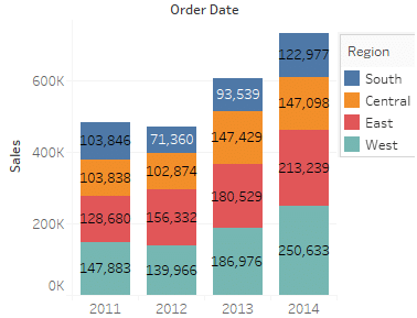
Knowing how to create a stack chart in Tableau is useful in comparing measures in a category. I will use Tableau provided Sample-SuperStore.xls as my datasource. Please visit how to connect to excel data source in Tableau to learn about connecting to data. Create a Bar chart using Region and Sales. I get a bar […]
Year by Year Comparison in Tableau
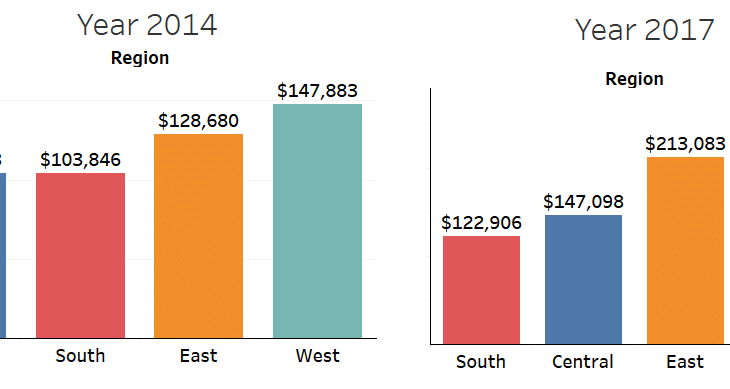
Recently, one of my client requested a dashboard where it is possible to do a year by year comparison in Tableau The requirement – if you have two charts, user should be able to perform comparison between any two Years such as 2014 vs 2017. I achieved this by creating a copy of the datasource in […]
Tableau Training Seminar – June 4th
Tableau Training Seminar June 4th,2016 Time : 3pm EST Address: 5900 Sawmill Road Dublin, OH 43017 Goto meeting links available. Contact chandraish@gmail.com
Cross table in Tableau

Cross table in Tableau is a special data structure where data is presented in a row and column format. See an example of a cross table below. This is a Sales Report of some fictitious company. This report shows the sale of Products by Employees to respective customers. Problems with loading Cross table in Tableau […]
How to dynamically generate a chart based on measure selection
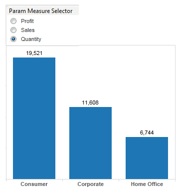
In this blog, I will discuss, how to dynamically generate a chart based on measures. Depending on the business requirement, sometimes you may have lot of key measures in your data. In such situation, you have a choice to – create separate chart for each measure or to create one chart and change the chart […]
Displaying multiple trend lines on the same axis in Tableau
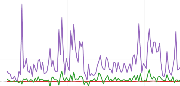
In my previous article we saw how to display 2 measures on a dual axis. Sometimes displaying multiple trend lines on the same axis in Tableau is necessary. In this article we will see how to achieve this requirement. Measure Names and Measure Values in Tableau Tableau automatically creates Measure Names and Measure Values in […]
How to create Combination Chart in Tableau
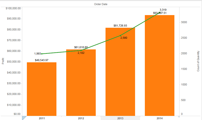
In this post I will How to create Combination Chart in Tableau. Combination charts or Combo charts are useful when you have to display two different units of data on the same chart. As the name suggest, combination chart is a combo of two charts. It can be a bar and a line chart or […]
How to display county outline over zipcode map
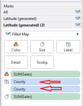
In my last article drill down maps, i worked on how to drill down from County to specific Zipcode map. In this article i will discuss how to create county outline/boundary over zipcode map in Tableau. Sometimes Zipcodes overlap between the counties and in such scenarios it is important to see the county outlines. If […]


 : http://techkoncepts.com/