


In this post I will How to create Combination Chart in Tableau. Combination charts or Combo charts are useful when you have to display two different units of data on the same chart.
As the name suggest, combination chart is a combo of two charts. It can be a bar and a line chart or some other chart type.
It will show two measures on the dual axis.
Dual axis displays 2 charts on different axis but overlays the charts on top of one another.
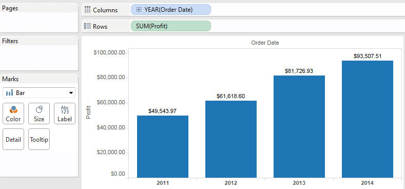
For example, you can compare over the years, Number of Product sold to generate Profit .
For this example, i will use Sample – Superstore.xls which comes with the Tableau installation.
Basic steps to Create a combination Chart
- Drag a dimension to the Columns shelf
- Drag 2 measures to the Rows shelf
- Click on one of the Measures pill and select Dual Axis
- Go to Marks Type and change the Mark Type of one of the measure to Line or your desired type
Creating Combination Chart in Tableau
- Launch Tableau desktop and connect to Superstore.xls
- Select ‘Orders’ from the data source and Go to Sheet1
- Drag Order Date to the Column shelf and Profit to the Rows shelf. If it gives your a trend line, navigate to Marks and select Mark Type as Bar. This will give you a bar chart.
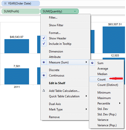
- Drag Quantity from the Measures to the Rows shelf. By default it comes as Sum. Click on the Quantity pill and change it to Count
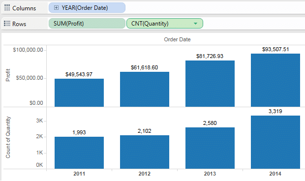
5. This will create Sum(profit) and Count(Quantity) charts on two separate axis and display them separately.
6. Click again on the Quantity Pill and select Dual Axis
7. This will create charts using dual axis and Quantity chart will overlay over Profit chart. Observe two measures under Marks.
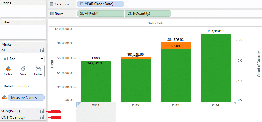
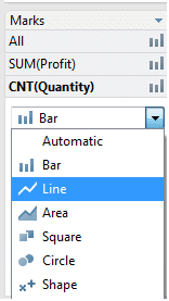
8. Go to CNT(Quantity) under Marks and change the Mark Type to Line
9. Your combination/combo chart is ready. it will display Sum(Profit) as Bar and Count of Quantity as Line.
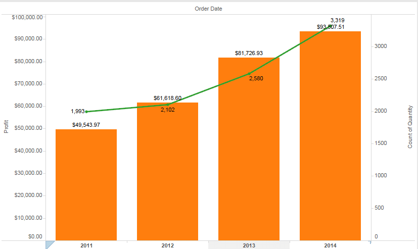
Combo charts are very easy to create and provide very helpful insights to data.
Combo charts or dual axis charts can display only two measures on a chart. What if, a requirement arises where you have to display multiple measures on the same axis.


 : http://techkoncepts.com/